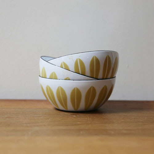
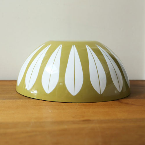
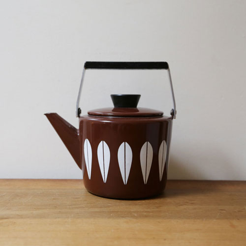
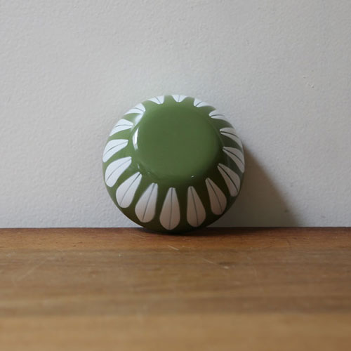
I fell in love with Cathrineholm the first time I saw it. With it's bright colors and graphic patterns it's a great representation of Scandinavian design. Based in Norway the iconic brand began production at the beginning of the 20th century and closed it's doors in 1970. Grete Pritz Kittlesen is the designer responsible for designing the shapes and colors for the enamelware line. The most frequently seen, and most recognizable pattern, lotus is attributed to Arne Clausen. It comes in a variety of colors complimented with white. Kittlesen is said to have disliked the lotus pattern stating she preferred the plates and bowls in a single color, which highlighted the shapes. I think the popularity of the lotus pattern speaks otherwise, but I do love a bright pop of color all on it's own as well!

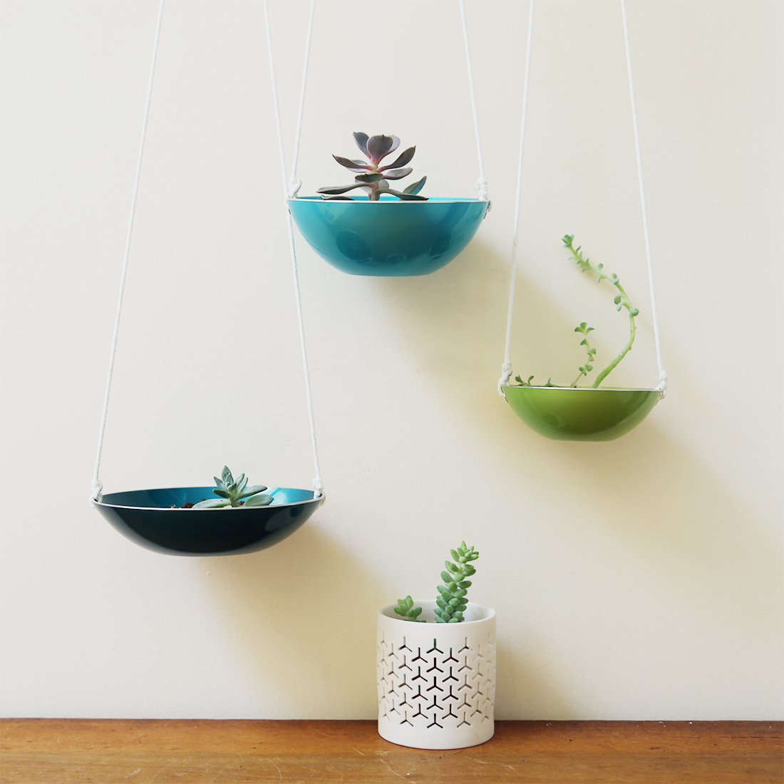
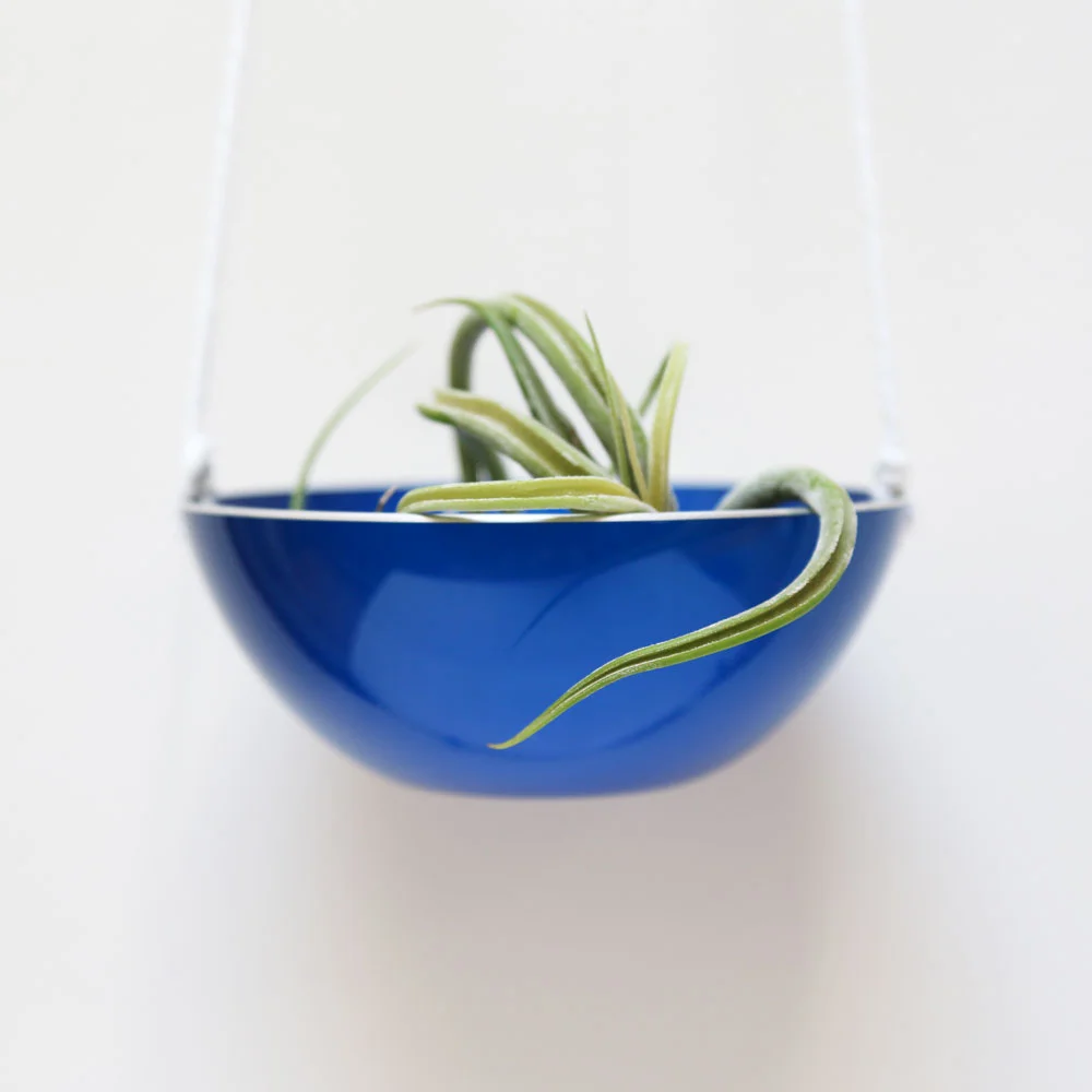
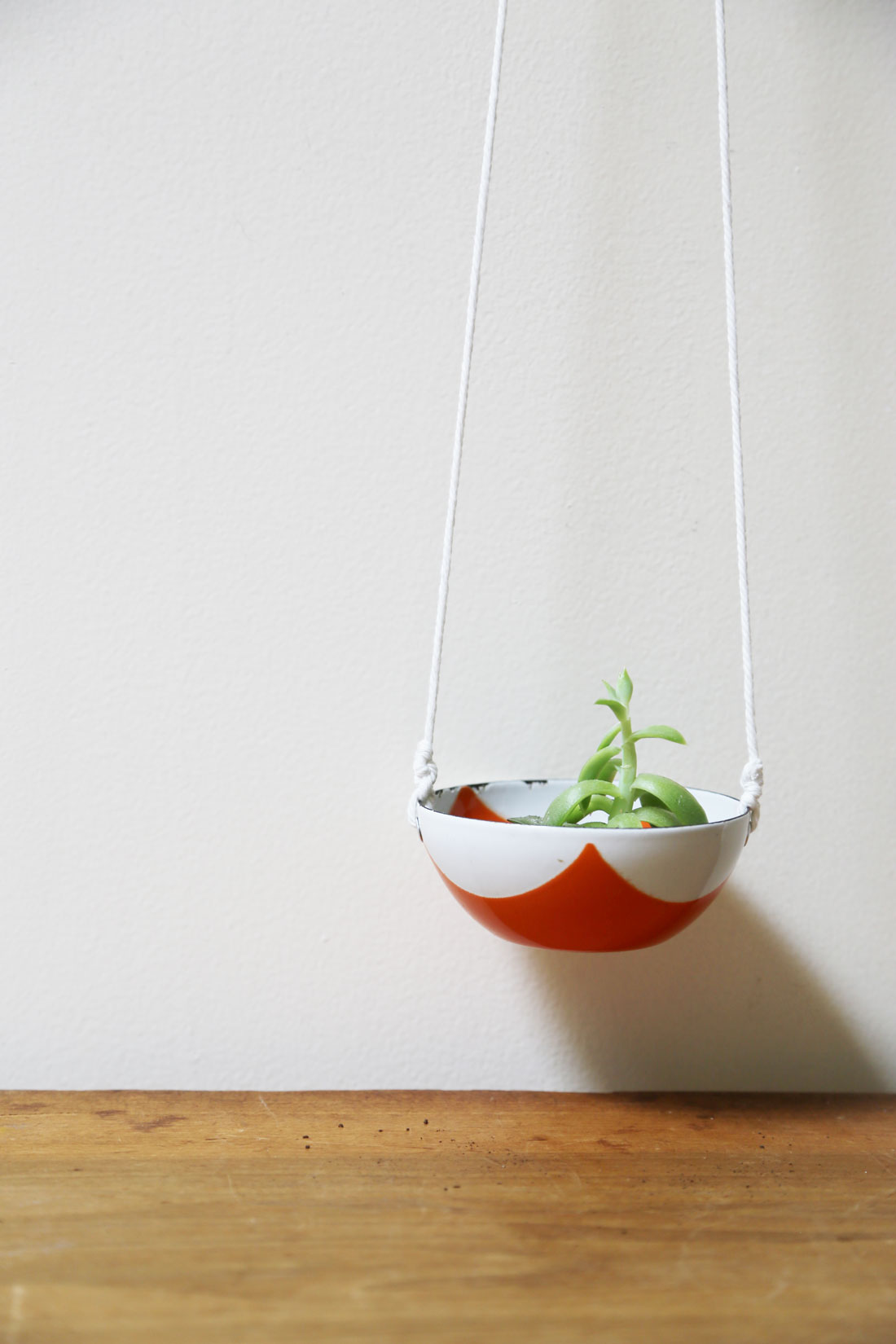
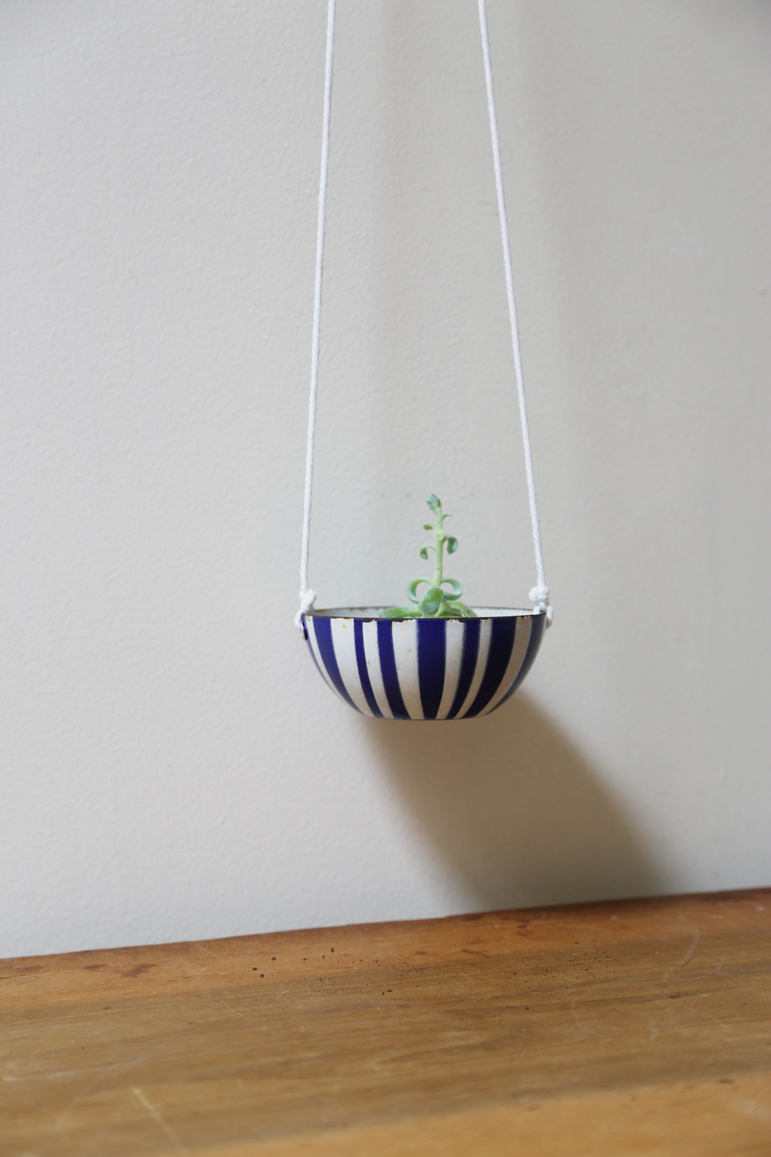
The flag pattern is another of my personal favorites. It is less often seen, but just as graphic and beautiful. This pattern has a periwinkle color which I really love. Below is an example of it in orange, repurposed as a hanging planter. Also below is a picture of the zebra stripe pattern in blue repurposed as well.
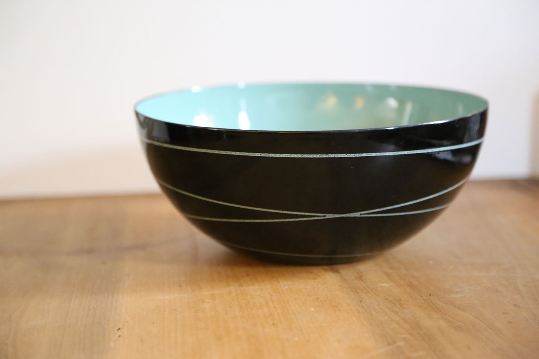
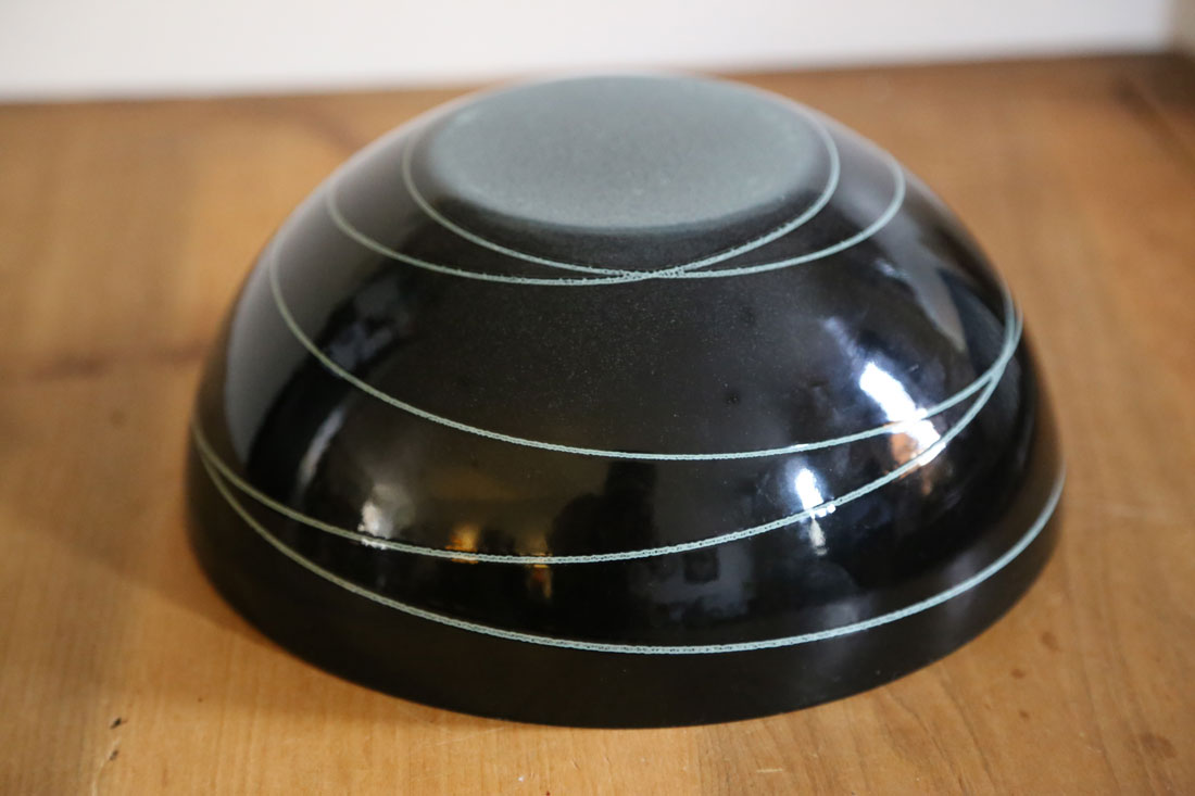
Cathrineholm has solid colored enamel pieces as well as pieces that are enameled on the outside and metal on the interior.They also have a more organic pattern called Saturn, here's an example in a lovely turquoise and black color combo.
There are other patterns out there, including snowflakes, a white background with a thick white stripe and an interior that matches the color of the stripe, and a great navy blue decorative pattern on a light blue background. Be careful, once you are bit by the Cathrineholm collecting bug it's hard to shake it. Before you know it you'll be swimming in bowls... but I like it that way!